Unlimited Graphic Design Services. Scale Without Adding Overhead.
Building an in-house design team is slow, expensive, and risky. Our unlimited graphic design service scales your production with consistent high-quality output and zero hiring commitment.

.webp)
Turn ideas like this into your next project
.png)
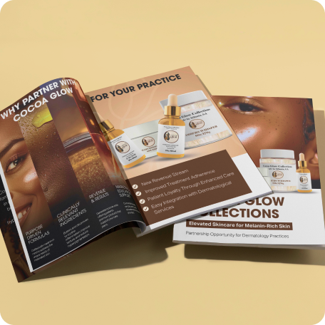
Elevated Skincare, Elevated Pitch
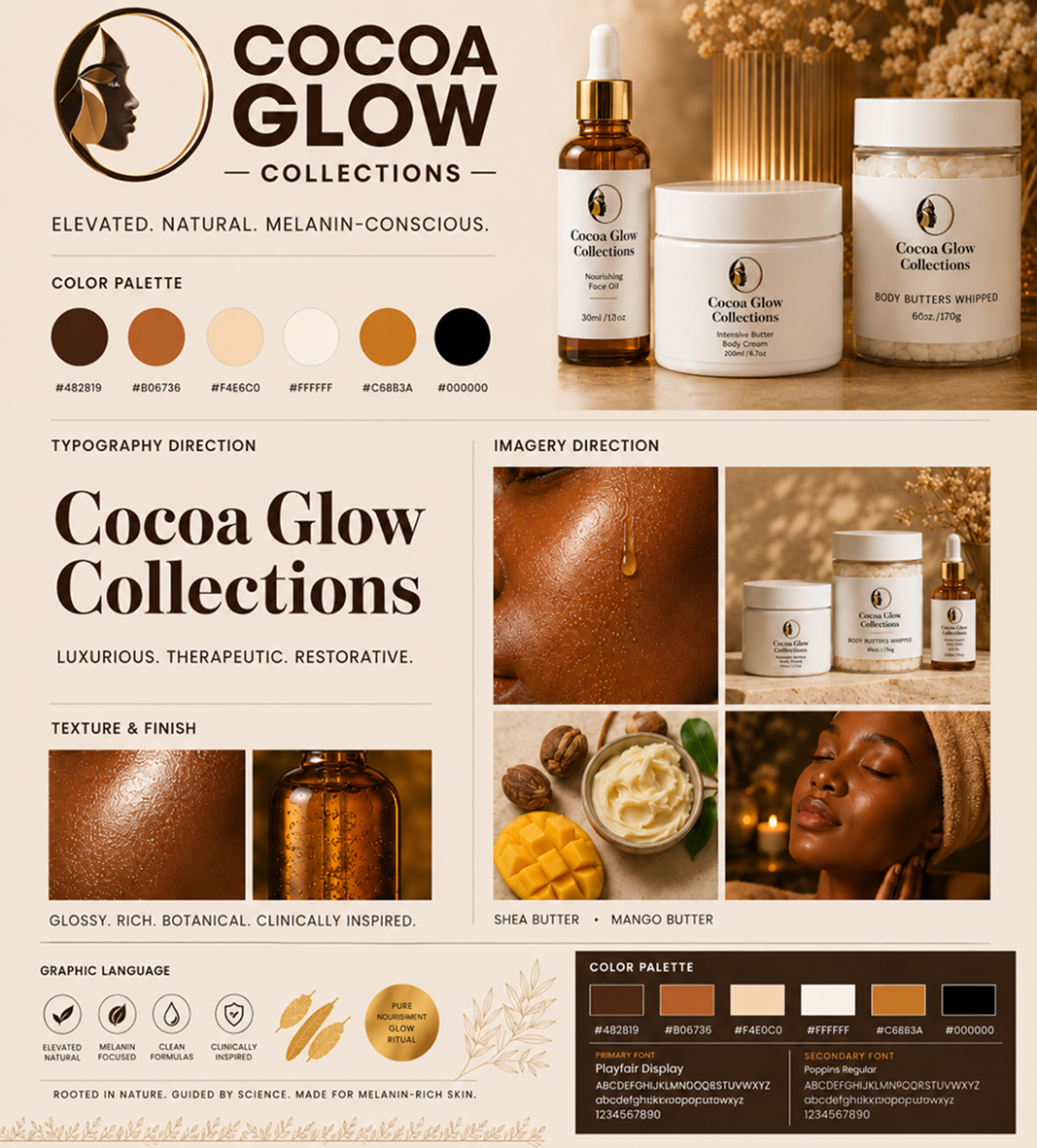
Cocoa Glow Collections, a skincare line formulated for melanin-rich skin, needed a partnership booklet to bring dermatology practices on board. The piece had to do double duty: read as a luxury beauty brand and hold up as a credible clinical partner.
The Vision
The goal was to give Cocoa Glow a presence that felt both premium and purposeful — glossy enough to sit next to any high-end beauty brand, grounded enough to earn trust with a clinical audience. Every page had to reinforce one message: this isn't skincare with dark skin as an afterthought, it's a line built around it from the ground up.
Direction
Photography
Real World Mockups
.png)
Turn ideas like this into your next project
.png)
Rooted In The Harvest
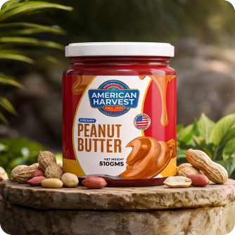
American Harvest, an organic peanut butter brand, needed packaging that could hold its own on a crowded pantry shelf while still feeling honest and homegrown. The jar had to read premium at a glance, without losing the warmth of a small-batch, farm-rooted product.
Direction
Photography

Real World Mockups
The final packaging balances heritage-brand confidence with organic, farm-to-jar honesty. The label reads clearly from a distance, the golden peanut butter itself becomes part of the branding, and the surrounding styling — stone, greenery, scattered peanuts — reinforces the "real ingredients, real harvest" promise before a shopper even reads a word.

Turn ideas like this into your next project
.png)
Turn ideas like this into your next project
.png)
Intro
Go Live in 25 is positioned as a bold growth-led platform built around vision, action and forward momentum. The identity challenge was to create a visual language that could carry the confidence of a movement without losing the direct, personal energy of a coaching and development brand.
The brand needed more than a motivational aesthetic. It required a recognisable system capable of moving between digital content, live sessions, community touchpoints, presentations, campaigns and physical brand applications. At the centre of the challenge was a simple question: how can an identity make ambition feel active?
The solution is a high-contrast visual system led by an interlocking GO monogram, an electric green signal colour and an oversized typographic voice. Every element is designed to feel immediate, energetic and ready to move—turning the existing idea of “big vision, bold action” into a distinct visual attitude.
Brand Brief
Personality
Go Live in 25 speaks with confidence rather than complexity. The brand is visually loud when it needs attention, but remains controlled through clean geometry and minimal composition. Its personality combines the momentum of a modern growth platform with the clarity of a focused personal development brand.
Vision of the Business
To create a growth-focused environment where vision is transformed into deliberate action. The larger ambition is to become a recognisable platform for people who are ready to move beyond planning, step into visibility and actively build the next stage of their personal or professional journey.
Target Audience
Ambitious entrepreneurs, emerging leaders, creators, independent professionals and growth-minded individuals who are actively seeking clarity, momentum and meaningful personal progress.
The audience values motivation, but responds more strongly to structure, action and visible forward movement.
USP
Rather than positioning personal development as passive inspiration, Go Live in 25 presents growth as something active, immediate and lived.
Logo Type
Combination Mark with Custom Monogram.
The identity combines a distinctive GO symbol with a bold typographic wordmark. The monogram gives the brand a compact, recognisable visual asset, while the full lockup clearly communicates the brand name and core attitude.This approach suits a modern growth platform because the symbol can independently lead digital avatars, merchandise and community assets, while the full logo remains strong in presentations, campaigns and branded communication.
Tagline
Big Vision. Bold Action.
Key USPs
1. Vision Made Actionable
Go Live in 25 shifts the conversation from simply imagining growth to actively pursuing it. The brand is centred on movement, decision and visible progress.
2. Built for Bold Momentum
The identity creates an energetic environment for people ready to take their next step. Its direct visual language reinforces confidence and forward movement at every touchpoint.
3. Growth Through Connection
The interlocking visual idea reflects a brand where ambition, community and action come together. Progress is positioned not as an isolated moment, but as part of a connected growth journey.
The Vision
The central vision was to create a brand that feels like the moment before action—the instant when an idea stops being a possibility and becomes a decision.
Go Live in 25 needed to communicate energy without visual chaos, ambition without corporate distance and confidence without becoming aggressive. The identity therefore combines bold scale, controlled geometry and electric colour to create a feeling of immediate momentum.
The logo acts as both a signature and a signal. Its compact monogram builds recognition, while the oversized typography creates a voice that is impossible to overlook. The identity supports the brand by giving its message of vision and action a visible form.
The creative direction: turn momentum into a visual language and make bold action impossible to ignore.
.png)
Usage Guide
.png)
Clear Space
The minimum clear space around the Go Live in 25 logo is defined as X, where X equals the width of the vertical stem of the lowercase “l” in the word “live.”
A minimum distance of 1X should be maintained on every side of the complete logo lockup.
No text, graphics, images or other visual elements should enter this protected area. Maintaining this space preserves the logo's strong visual hierarchy, keeps the monogram clearly separated from surrounding content and protects the impact of the typographic composition.
Visual demonstration suggestion: isolate the vertical stem of the “l” as a small black rectangular measurement unit labelled X. Repeat the unit around all four sides of the complete logo and use thin construction lines to indicate the protected boundary.
Positioning Map
The personal growth and coaching category often sits between two visual extremes. At one end are traditional development brands built around formal, conservative and corporate communication. At the other are highly expressive motivational brands that depend heavily on inspirational language and temporary visual trends.
Go Live in 25 occupies a more distinctive position: boldly progressive and strongly action-led.
The identity feels modern and expressive, but its controlled geometry prevents it from becoming visually chaotic. It is designed for an audience that wants energy with direction—positioning the brand as a contemporary growth platform built around action rather than passive motivation.
.png)
1 Momentum becomes Confidence
The brief asked for : An identity that feels active, immediate and capable of pushing people toward their next move.
The decision : A bold typographic structure was selected to give the brand a strong visual voice. Large lowercase letterforms create scale and confidence, while the stacked composition makes the name feel direct and immediate.
Where you see it : In the oversized “live” and “in 25” typography, the compact line spacing and the strong black forms that dominate the visual hierarchy.
2 Connection becomes Belonging
The brief asked for : A recognisable symbol that could represent growth as a connected experience rather than an isolated journey.
The decision : The letters G and O were brought together into a single interlocking monogram. Their shared structure creates visual continuity and makes two individual forms feel like one connected unit.
Where you see it : In the custom GO symbol, where the circular letterforms overlap, meet and visually flow into one another.
3 Energy becomes Action
The brief asked for : A visual identity capable of communicating urgency and forward momentum without depending on complex graphics.
The decision : An electric green was introduced as the identity's primary signal colour. Rather than using multiple bright tones, one highly recognisable colour creates concentrated visual energy.
Where you see it : In the vivid green circular field behind the black GO monogram. The intense contrast immediately attracts attention and gives the symbol an active, digital-first presence.
4 Clarity becomes Direction
The brief asked for : A system that could communicate ambitious ideas in a simple, memorable and highly usable form.
The decision : The identity was reduced to essential elements: a monogram, a circle, bold black typography and one signal colour. The restraint gives every component a clear role and creates a scalable brand system.
Where you see it : In the minimal logo construction, limited colour palette, clean white space and clear hierarchy between the symbol, brand name and tagline.
Concept Draw
The early concept process explored multiple interpretations of GO, movement, growth and activation through rapid hand sketches and structural studies. Initial directions investigated standalone letterforms, arrows, pathways, forward-facing forms, linked circles and abstract movement symbols.
The G and O relationship became the central area of exploration. Sketches tested overlapping letters, continuous paths, negative-space connections and circular containers to understand how the brand name could become a compact visual signature.
Typography was explored alongside the symbol to establish the right balance between energy and clarity. Different stacked compositions, letter weights and logo structures were tested before the strongest direction emerged: a bold interlocking monogram supported by oversized lowercase typography.
Further iteration focused on circular proportion, letter overlap, internal negative space, alignment and hierarchy. The final direction was selected because it communicated connection and movement without adding unnecessary visual complexity.
.png)
.png)
From Sketch to Screen
The selected monogram was digitally refined by simplifying the curves, balancing the internal spaces and controlling the relationship between the G and O. Circular proportions were adjusted to improve recognition at smaller sizes, while the typography was aligned to create a stronger relationship between symbol and name.
Weight, spacing and scale were carefully tested to ensure the logo remained readable across digital and physical applications. The result is a distinctive mark that feels bold at large scale while retaining its recognisable silhouette in compact brand touchpoints.
.png)
The Symbol
The Go Live in 25 symbol begins with two letters, but its meaning lives in the moment they connect.
The G feels open and active—a form that has space to move, enter and continue. The O brings circularity, continuity and a sense of completion. Instead of allowing these letters to exist as separate initials, the symbol pulls them together. Their forms overlap until GO becomes a single visual action.
Placed inside an electric green circle, the monogram feels almost like an activation signal: a button, a pulse or a visual command to begin. This connection is central to the brand. Vision alone remains an idea. Action alone can lack direction. When the two meet, momentum begins.
The geometry gives the symbol strength and simplicity. Its circular silhouette is easy to recognise, highly adaptable and naturally suited to digital avatars, event graphics, merchandise, presentation covers and social content.
What makes the mark memorable is its directness. It does not illustrate growth literally. Instead, it captures the feeling of moving—GO is not simply read. It is felt as an instruction.
.png)
Typography
.png)
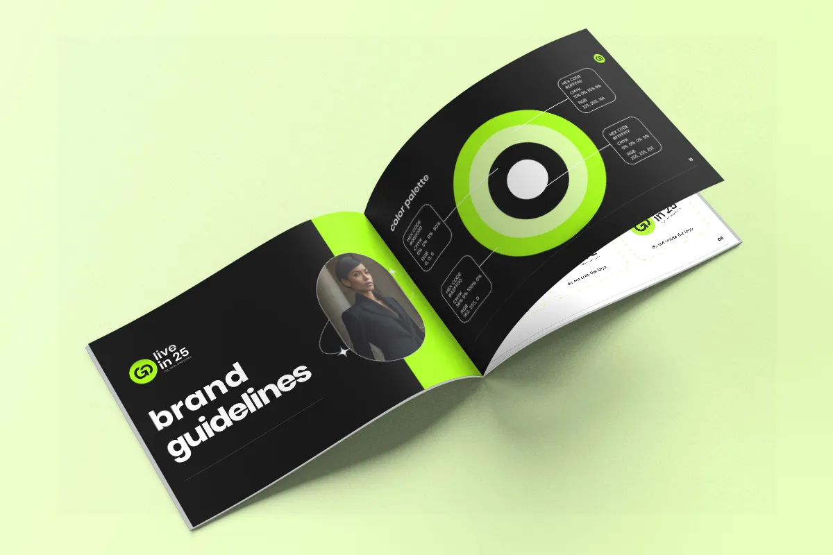
Colors
.png)
The Go Live in 25 colour system is deliberately concentrated. Electric green creates energy. Black creates authority. White creates clarity.
The palette feels digitally relevant, progressive and highly visible—qualities that support a modern personal growth and action-led platform. The extreme contrast strengthens recognition and allows the identity to move between bold event graphics, social communication and clean presentation systems without losing consistency.
Rather than depending on a broad decorative palette, the brand builds recognition through disciplined repetition of one distinctive signal colour.
Real World Mock-Ups
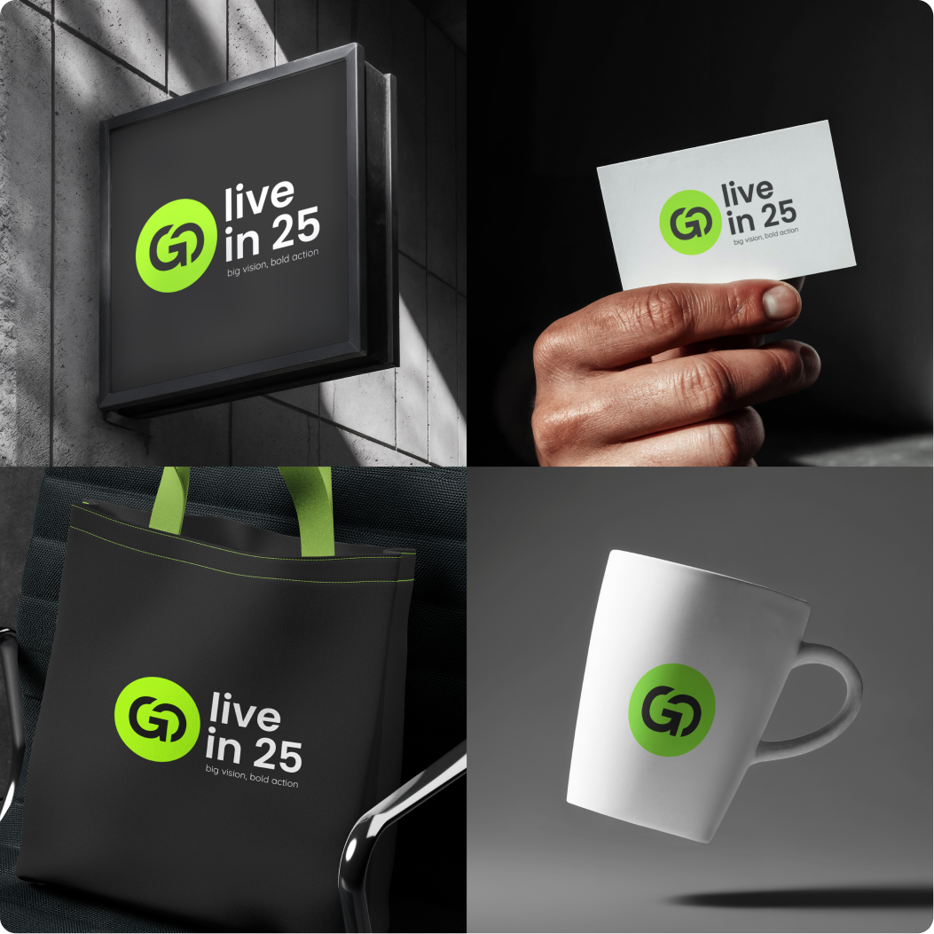
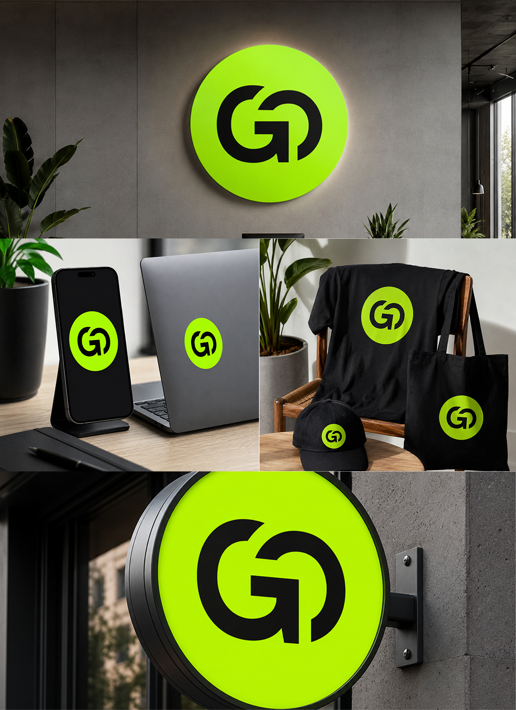
The Go Live in 25 identity should be tested where the brand actually creates momentum: on screens, in live environments and across community touchpoints.
Real-world applications reveal whether the GO monogram remains recognisable at small scale, whether the electric green maintains sufficient impact in large-format communication and whether the bold typography creates a consistent visual voice across different content types.
The identity should move naturally between physical and digital environments. From a small social media profile icon to an oversized stage screen, every application should reinforce the same feeling of energy, clarity and forward action.
Trusted by Clients Around the World


.svg)

Testimonial case study

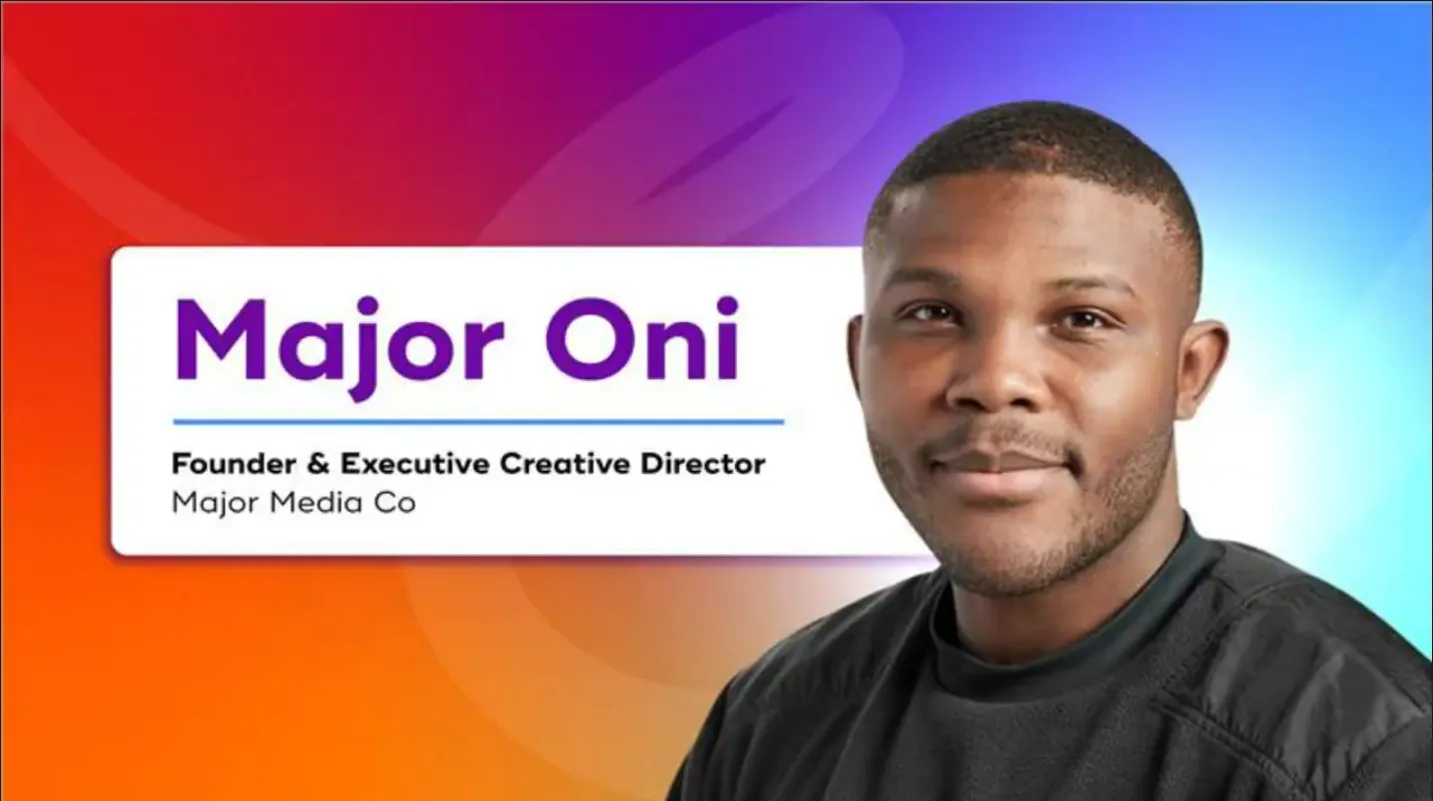
How Digital Marketing Design by Cueball Creatives Helped Purple Orchid Media Enhance Client Engagement
"Working with Cueball Creatives is always a smooth and enjoyable process. Deadlines are always met on time and communication is top-notch. Priya and her team consistently exceed my expectations. Their work has significantly improved our client engagement, making our marketing campaigns more effective. I highly recommend Cueball Creatives to any digital marketing agency or business."
.webp)
How Cueball Creatives' Designs Helped Skyrock Digital Build a Stronger Brand Presence
"We are very happy with Cueball Creatives. The designs are exactly what we ask for, and the team works extremely fast. Their creativity and efficiency have strengthened our brand identity and made our marketing materials more compelling. It's great to have a dedicated partner! Definitely recommended!"

Growth Shouldn’t Mean Choosing Between Speed, Quality & Cost
Most agencies scaling design production often hit the same wall: inconsistent output, slow turnarounds, and hiring they can't justify.
With our structured unlimited graphic design subscription plans and on-demand design subscription services, your creative production keeps moving without delays, quality and consistency bottlenecks, or the need to hire designers.
Your Dependable Creative Extension Without the Overhead
Outsourced graphic design services tailored for your standards and workflow, not churned out like an unlimited graphic design factory. And fast turnaround doesn't mean a compromise on quality.

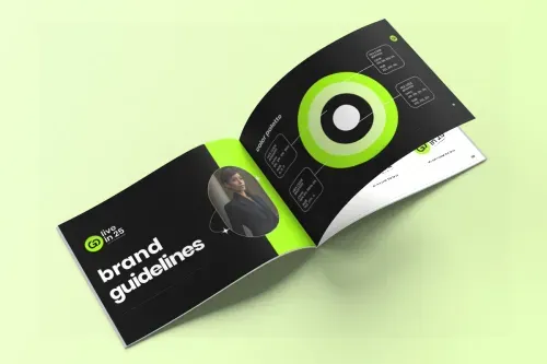
Graphic Design Support Across Every Touchpoint
From campaign assets to brand collateral, your dedicated designer handles the full range of deliverables your clients need.
Branding Identity

Social Media Graphics & Digital Ad
Video Animations
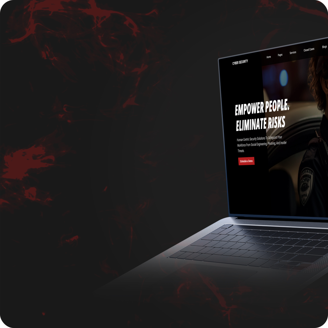
Website UI/UX & Graphics
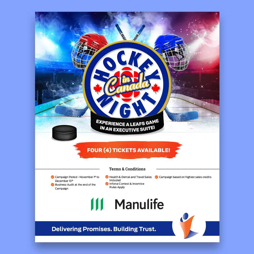
Email Marketing Graphics

Event & Webinar Graphics
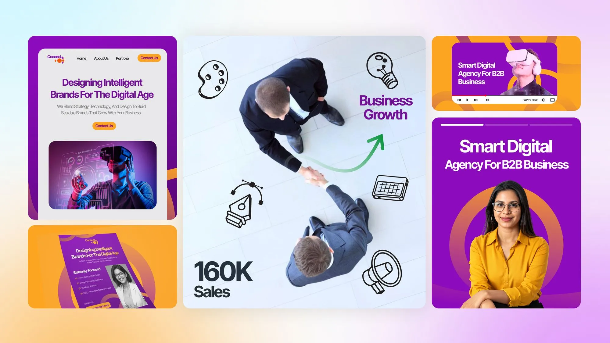
Blog & Article Graphics

Presentation Design
.avif)
Business Collateral
Creative Infrastructure That Keeps Up With Your Needs
Outsourcing design shouldn't mean you end up managing it all yourself. Cueball’s graphic design subscription gives you a dedicated creative partner operating within a structured workflow designed for predictable output, consistent quality, and minimal oversight.

At one flat monthly price, every plan includes:
Unlimited Graphic Design Subscription — Your Designer, Your Team, One Flat Fee
Brand identity, digital ads, print, video, UI, presentations — all covered.
Starter
Growth
Scale
Starter
Growth
Scale
A Structured Creative Workflow to Reduce Creative Friction
Your unlimited graphic design subscription follows a streamlined creative production system, designed so output keeps moving while you stay focused on your business.

Book Discovery Call & Start Free Trial
We’ll align on your goals, then start a 7-day free trial with a real task. No credit card required. No commitment.

Submit Your Design Requests
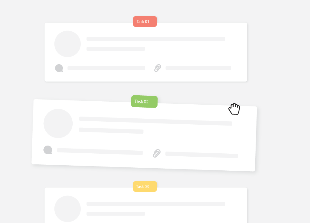
Unlimited design requests and unlimited revisions managed on Asana, with communication wherever you prefer.
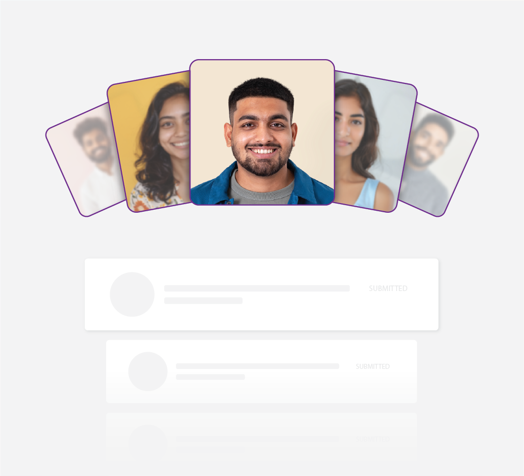
Select Your Dedicated Designer
You review curated samples and select the designer that aligns with your brand. This is your dedicated designer from day one.

Subscribe to an Unlimited Plan
Choose the plan that matches your output needs, with a flat monthly fee and no contracts or hidden fees.
Your Designs Get Delivered
Your designer works on your unlimited graphic design tasks in parallel, based on your plan’s capacity. You review and track progress on Asana until final approval.
Trusted by Teams That Need Consistent Creative Output
See why teams rate us among the best unlimited graphic design services and best monthly graphic design services for consistent, scalable creative production.

.svg)



Frequently Asked Questions
Common questions about our graphic design subscription pricing
Your unlimited graphic design subscription is designed to support virtually all the creative assets your marketing needs, from graphic design packages for small businesses and enterprise teams. These include:
- Social media graphics
- Digital ad creatives
- Infographics
- Video and motion graphics
- Website graphics
- Email marketing visuals
- Event and webinar graphics
- Blog and article visuals
- Presentation design
- Business collateral
- Web design subscription
With our unlimited graphic design services and graphic designs' unlimited capacity model, you can request as many tasks as you want. Your tasks will move based on your plan’s capacity. Our affordable design subscription plans are built for small businesses, agencies, and enterprise teams alike.
While our unlimited graphic design subscription covers all major design types across marketing, brand, digital, print, web, and video, there are a small number of request types we do not support:
- Fine art illustrations and digital game assets
- 3D modeling, CAD, and advanced 3D rendering
- Web development, coding, and interactive PDFs
- Copywriting, manual typing, or text-heavy content creation
- Trademarked or legally restricted content
- Complex long-form video production (60+ seconds)
Your subscription includes basic motion graphics such as GIFs, simple social media animations, and short looping visuals. Complex video production, long-form videos, or advanced 3D animations may require a custom solution.
Yes! Our dedicated designer can take creative directions and produce unique visuals that align with your brand. While extremely specialized requests may need discussion for feasibility, most marketing and business design ideas are fully supported.
Yes. Your unlimited graphic design subscription comes with a dedicated, brand-aligned designer who learns your visual style once and maintains it across every deliverable. No rotating designers losing context on your brand. No output that looks like it came from five different people. The same standard on task one as task one hundredth, without you having to chase it.
Every subscription includes unlimited revisions, so you can refine designs until they fully align with your standards. If the output isn't right, your designer acts on your feedback promptly. No chasing, no re-explaining from scratch. Everything is tracked in one place, and we are not satisfied until you are.
Your unlimited graphic design free trial gives you 7 full days to experience the complete workflow before committing to a paid plan. Simply book a discovery call to get started. No credit card required, no contracts, and no commitments. During the trial, you can submit real design requests, evaluate turnaround times, and assess design quality firsthand. You only continue with a graphic design subscription plan if you are 100% satisfied.
No. Your 7-day trial is completely free. You can experience our workflow, see how your designer works, and evaluate turnaround and quality without paying a cent. Only if you are 100% satisfied do you continue with a subscription.
Submit all design requests and briefs through your dedicated Cueball project management portal on Asana. Each brief is reviewed by your designer before work begins, and you can track every active task, leave revision feedback, and communicate directly in one place. We also keep you updated via your preferred channel, email, Slack, or WhatsApp, so your graphic design subscription workflow stays entirely in sync with how your team operates.
Every unlimited graphic design subscription plan includes unlimited revisions. You can request as many rounds as needed until every design fully matches your brand standards and expectations. Revision turnaround follows the same 12-48 hour window as new requests. Simply leave feedback in your Asana task thread, and your dedicated designer will act on it.
Your primary designer, the one you selected during onboarding, handles all your requests and is your single point of creative contact. You always know exactly who is working on your account, and they already know your brand. On the Scale plan, your designer is supported by a small dedicated creative team to keep parallel tasks moving without compromising quality or consistency. Creative ownership always stays with your chosen designer, so output stays on standard regardless of the volume of your graphic design subscription tasks.
No. With your unlimited graphic design subscription, you get a dedicated brand-aligned designer who becomes your long-term creative partner. They learn your brand style and preferences, so every new request requires less briefing, fewer revisions, and faster turnaround. You won’t have to deal with rotating designers or inconsistent quality.
You choose your designer from curated samples during onboarding, so alignment starts from day one, not after a round of misaligned output. If at any point the fit isn't right, we manage the transition and brief your new designer thoroughly before they take over, without any disruption to your workflow.
Our designers may use AI tools as creative aids for ideation and workflow efficiency, but all final designs are created and refined by your dedicated human designer. We never deliver AI-generated output as a finished product. Your brand deserves genuine creative work, and that is always what you receive.
Yes. Our Scale plan is built exactly for this. If you manage multiple brands, run a founder-led agency, or handle client work, you can request designs across multiple brands under a single flat-rate graphic design subscription, making it one of the most cost-effective design subscription services for agencies and multi-brand teams.
Yes. You have 100% ownership of all deliverables created through your unlimited graphic design services, so you can use your assets anywhere, anytime, without restrictions.
Canceling your graphic design subscription is straightforward. Simply send us an email before your next billing cycle, and we will process it immediately. No notice periods, no cancellation fees, and no lengthy documentation. We would appreciate any feedback on how we can improve, but there is no obligation to provide it. Your access continues until the end of your current billing period.
Yes. If your creative demand slows temporarily, you can pause your subscription instead of canceling. Simply reach out to our team, and we will hold your plan until you are ready to resume. Your dedicated designer and brand settings are retained, so production picks up exactly where it left off with no onboarding delay when you restart.
Our team typically operates from 10:30 PM to 8:00 AM EST and is highly flexible to accommodate your time zone and schedule. Support is available 7 days a week, and your dedicated designer is active Monday-Friday. If you need availability adjustments, let us know during onboarding, and we will align to your preferences.
Latest from the Blog
Practical design insights, production tips, and creative strategy for founders, marketing teams, and agencies.
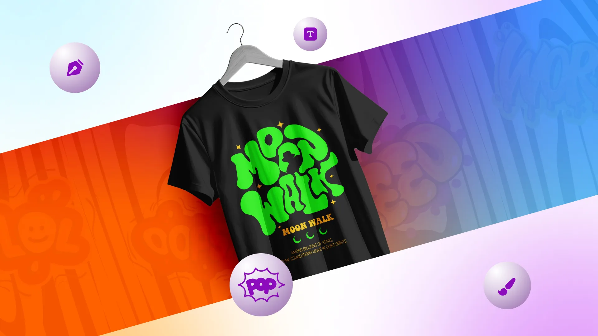
The Graphic Design Revolution Shaping the Future of Streetwear
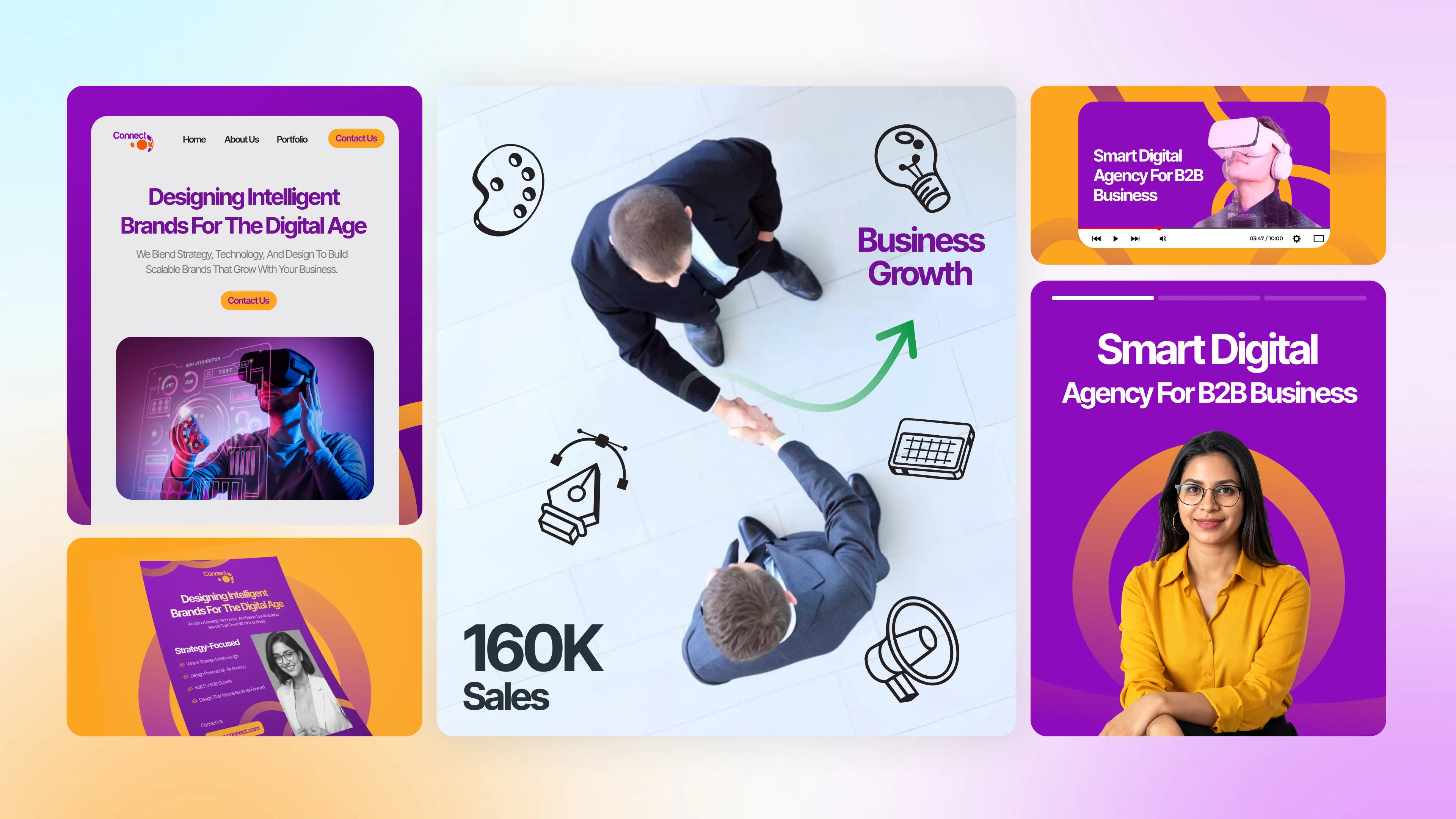
What Type of Graphic Design Does Your Business Need? (Logo, Social Media, or Branding?)
10 Best Unlimited Graphic Design Subscription Services in 2026 (Ranked for Quality, Speed & Brand Consistency)
Scale Design Without Building an In-House Team
Get dependable, brand-aligned creative support with our capacity-based unlimited graphic design subscription at a flat monthly fee.